Microsoft Commerce Health Dashboard
(content from landing page) Microsoft Commerce Health Dashboard
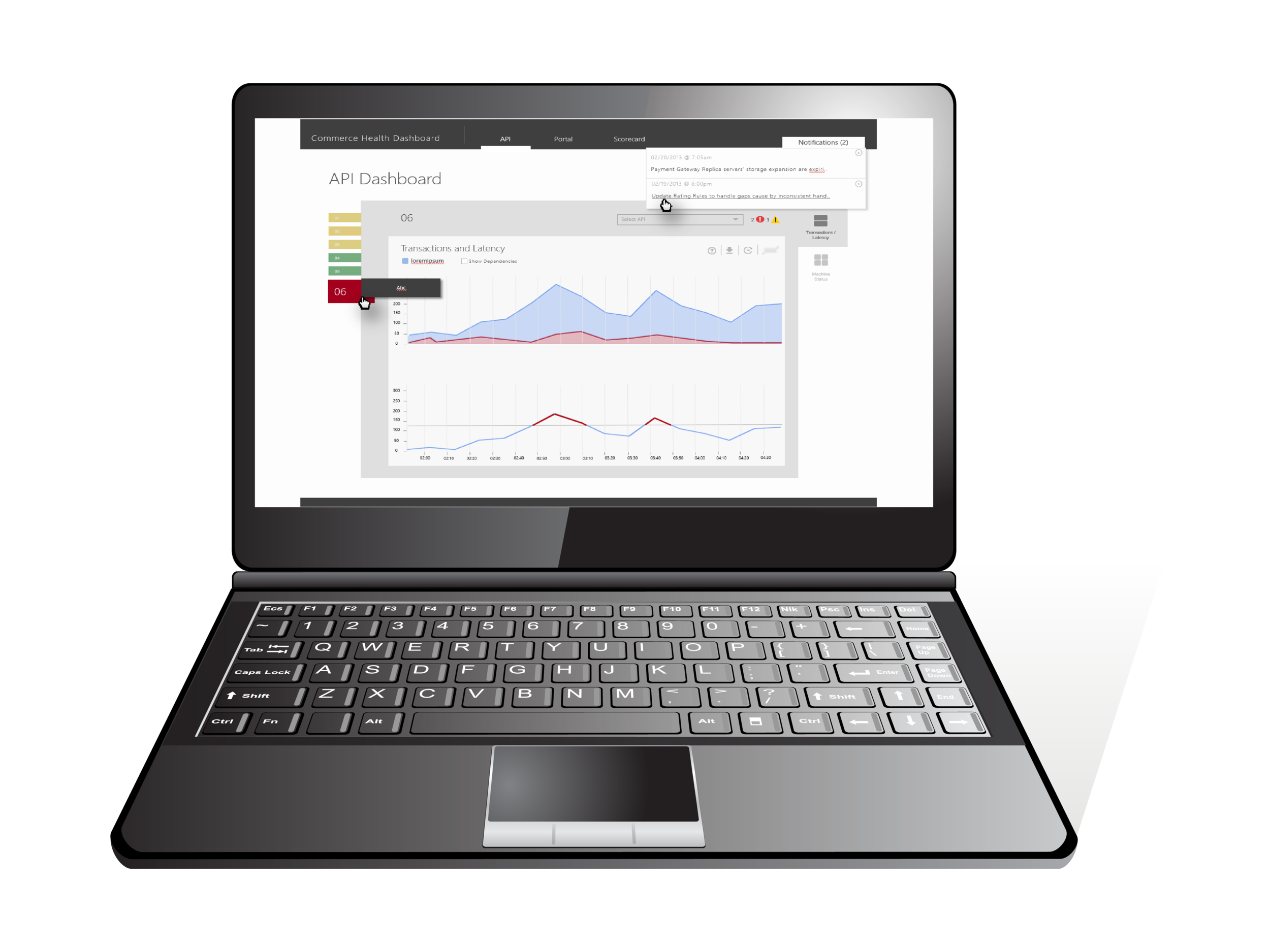
A portal to visualize the performance of Microsoft's Commerce APIs and to help incident managers monitor, investigate and diagnose services that have crashed or are problematic.
OVERVIEW
A tool to chart and visualize the health of Microsoft's Commerce APIs and shared services so as to help incident managers and developers monitor, investigate and diagnose services that have crashed or are problematic.
Background
There are a whole bunch of ways in which you can make a transaction with an entity as large as Microsoft. From creating an Xbox account, purchasing a movie, signing up for Office 365 Enterprise tools and more. These different services and APIs often depend on each other to work cohesively in a wide ranging ecosystem.
The Commerce Health Dashboard was envisioned as a cross-functional tool to helps teams within the Commerce Platform Group gauge the health of their services and monitor any dips in performance. The tool's aim is to empower it's users in building a dashboard of data visualization charts s that will help them monitor the activity of their APIs across various performance parameters.
PROCESS
Design
I was involved in the envisioning of the tool and its user experience from the start. I first worked on creating and early model Proof of Concept (POC) for the dashboard. I was then involved in refining the designing and preparing it for its first version release with some changes to the experience.
My role
Responsible for the information architecture and ensuring cohesive navigation.
Created early proof of concept mockups for stakeholders.
Iterated designs to align with business and user needs.
Followed Agile methodologies for end to end product delivery
Conducted design reviews with high fidelity wireframes to gather feature team feedback and iterate on design solutions .
LAUNCH and IMPACT
The Service Health Dashboard is a key project for the Commerce group because it was aimed to aid developers and incident managers with any information they may need in fixing a business impacting issues. Many users had created their own It’s goal is to fade out the broken and outdated experiences that are used currently in gathering information. It’s larger goal is to provide a one stop shop for monitoring, investigating, diagnosing and providing segues to fixing incidents.
Being an internal tool and one needed with great urgency I worked within tight timelines to support software in implementing an alpha version. The tool was released to a small set of users to use and test. The user feedback generated a backlog and path for incremental iterations to make the API Health Dashboard a useful tool.
ITERATIONS AND OPPORTUNITIES
I wasn’t around for the later iterations of the API Health Dashboard but initial feedback suggested that the tool was simple and easy to use with lots of useful feedback on how it could improve.
Users liked the translation of complex data into simple charts and views. This was especially helpful when reporting to people who needed an overview.
The automation and identification of the exact source of the issue through data visualization was a huge value add to users, as identification of the issue would usually involve running queries on thousands of issue logs.
Users like the ability to create their own custom charts and view using multiple parameters
Users expressed need to view data in more formats/ dimensions depending on the complexity of the data set.
There was a recognition for the custom charts feature to grow into a more robust version of itself to support different teams’ unique reporting needs.